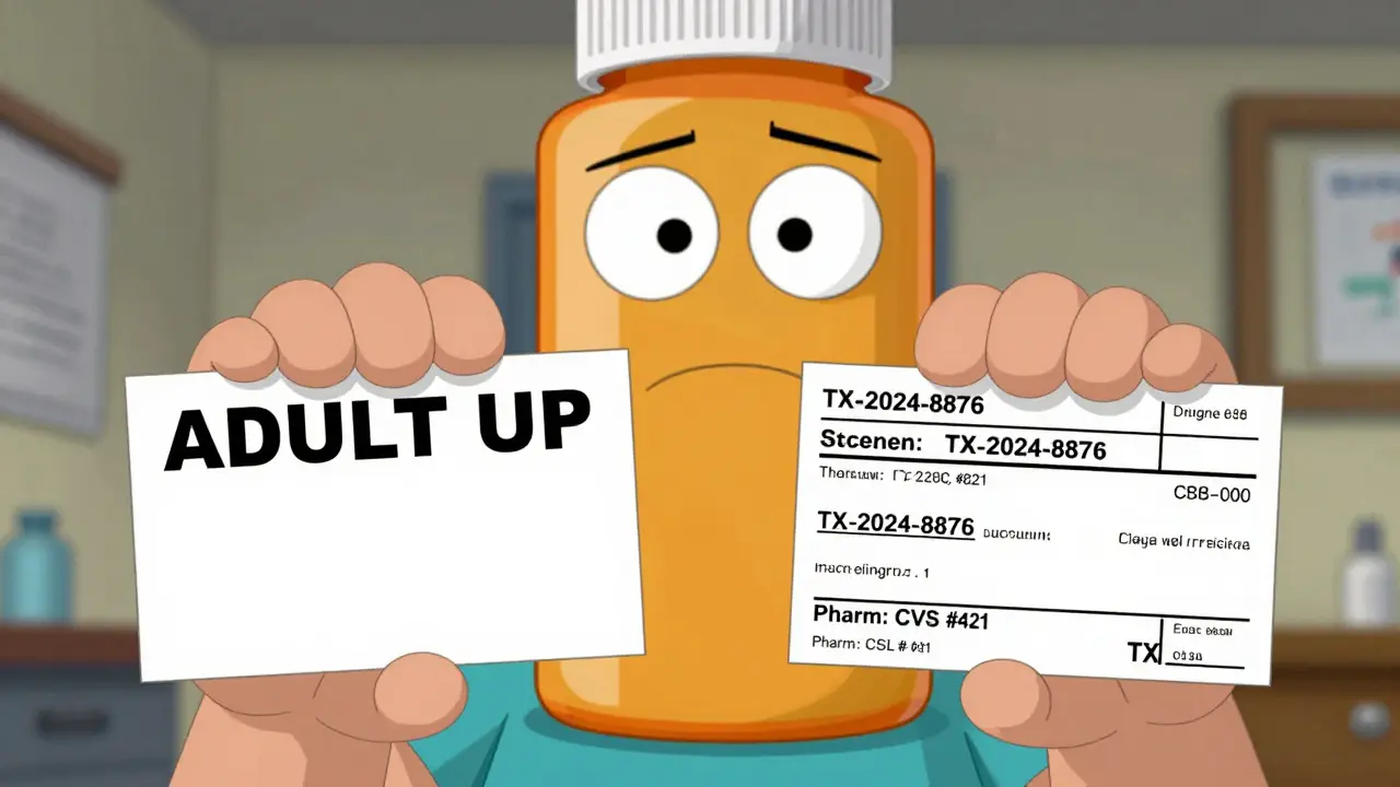
Have you ever noticed that your prescription label looks totally different from your spouse’s, or even from your own last refill? One time, your pill bottle says "Take one by mouth twice daily." The next refill? It says "Take 1 tablet, 2x a day." The font is smaller. The spacing is tighter. The reason for the medicine? Gone. You start to wonder-did they mess up? Or is this normal?
It’s normal. And it’s dangerous.
In the United States, there is no single rule for what a prescription label must look like. That means your medication bottle could be designed by one of dozens of pharmacy software systems, shaped by 50 different state laws, and printed on a label template that changes every time your pharmacy switches vendors. No two labels are exactly alike-and that’s not an accident. It’s a system built on fragmentation.
Why Your Label Changes Between Refills
You refill your blood pressure pill at the same CVS every time. But last month, the label had big, bold text. This month, the instructions are crammed into a narrow strip. The pharmacy name is in a different spot. The prescription number? Now it’s at the bottom. You didn’t change anything. Your doctor didn’t change anything. So why does the label look like a different language?
The reason? Pharmacy management systems. There are over a dozen major software platforms used by pharmacies across the country. Each one has its own default label layout. When your pharmacy upgrades its system, or switches from one vendor to another, your label changes. A 2022 survey of pharmacy technicians found that 73% had customers return because they couldn’t understand their new label format-even if it was the same pharmacy chain.
And it’s not just big chains. Independent pharmacies use different systems too. One might use a simple template from a local vendor. Another might be on a national platform that auto-generates labels based on FDA data. The result? Two people filling the same prescription at different pharmacies get two completely different labels.
The Rules That Don’t Really Exist
You’d think the government would step in. After all, this is about safety. But the FDA doesn’t actually control what’s printed on the bottle you hold. The FDA’s rules (21 CFR § 201.56) focus on the professional drug information-what doctors and pharmacists see in manuals. They require things like drug interactions, side effects, and dosing for professionals. But they don’t say anything about font size, spacing, or plain language for patients.
The only real attempt to fix this came from the United States Pharmacopeial Convention (USP). In 2012, they released General Chapter <17>, a set of evidence-based standards for prescription labels. These aren’t laws. They’re best practices. And they’re detailed:
- Use sentence case: "Take one tablet twice a day," not "TAKE ONE TABLET TWICE A DAY."
- Use sans-serif fonts like Arial-no fancy script or condensed type.
- Use 1.5 line spacing so text doesn’t run together.
- Print in black on white. No gray text. No light backgrounds.
- Include the reason for the medicine: "for high blood pressure," not just "for HTN."
- Always put the most important info first: dosage, frequency, duration.
These rules aren’t theoretical. They’re based on studies showing that patients misunderstand labels when they’re cluttered, small, or use medical jargon. One study found that 68% of patients had trouble reading their labels at least sometimes. And 22% said they’d made a mistake because of confusing labeling.
State Laws Make It Worse
Here’s where it gets messy. Even if a pharmacy wants to follow USP <17>, state pharmacy boards often force them to do something else.
For example:
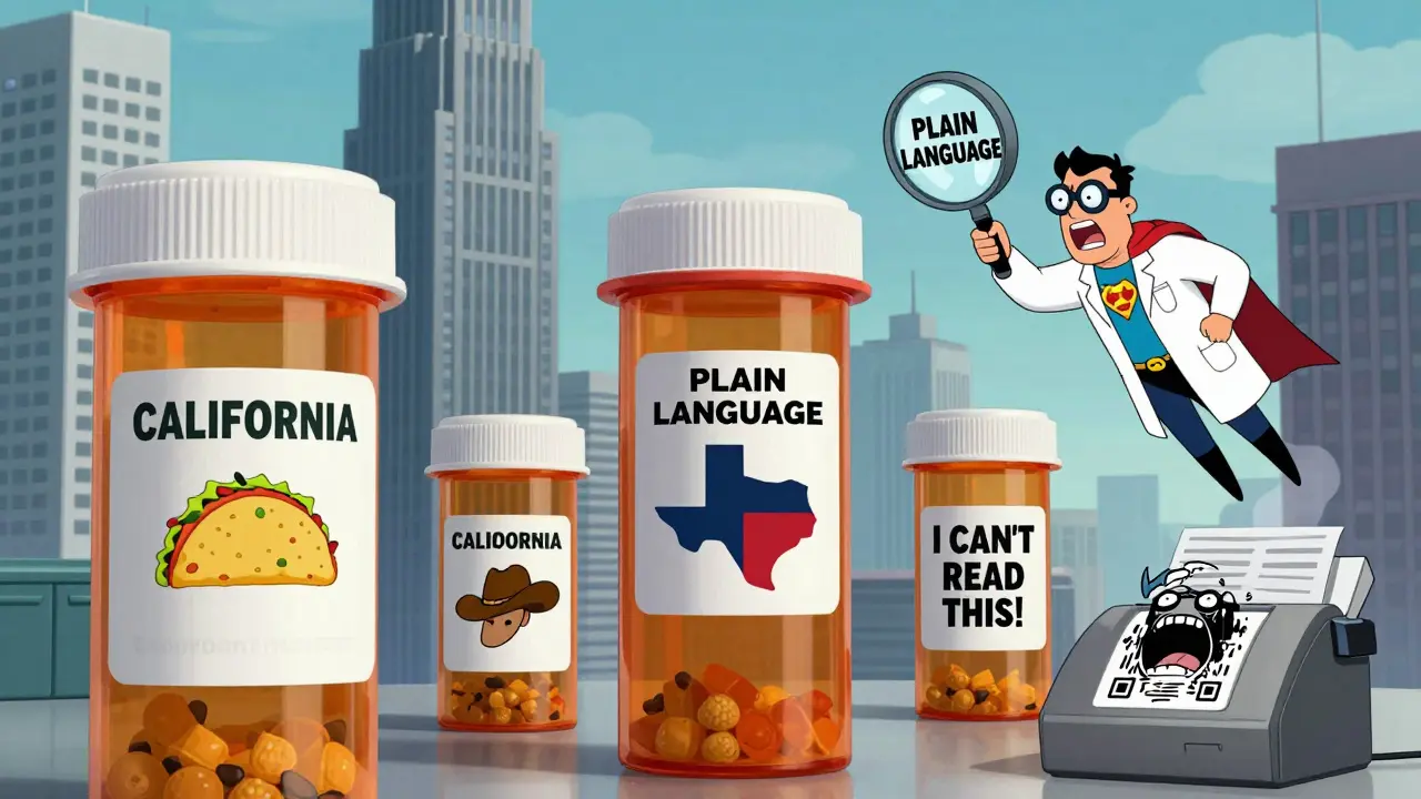
- California requires bilingual labels for certain medications.
- Texas mandates the pharmacy name, address, and phone number be printed in a font no smaller than 10-point Times Roman.
- Some states require the prescriber’s name to appear in a specific location.
- Others demand unique prescription IDs with exact formatting.
So now the pharmacy has to follow USP’s readability rules, but also fit in 5-7 extra state-mandated fields. The result? A label that’s overcrowded. Text gets squeezed. Font sizes shrink. The clear instructions? Buried under legal requirements.
As of 2023, only 28 states have adopted USP <17> in full. And only 15 have fully implemented it. That means in over half the country, pharmacies are legally allowed to use labels that experts agree are unsafe.
What Happens When Labels Are Confusing
It’s not just annoying. It’s life-threatening.
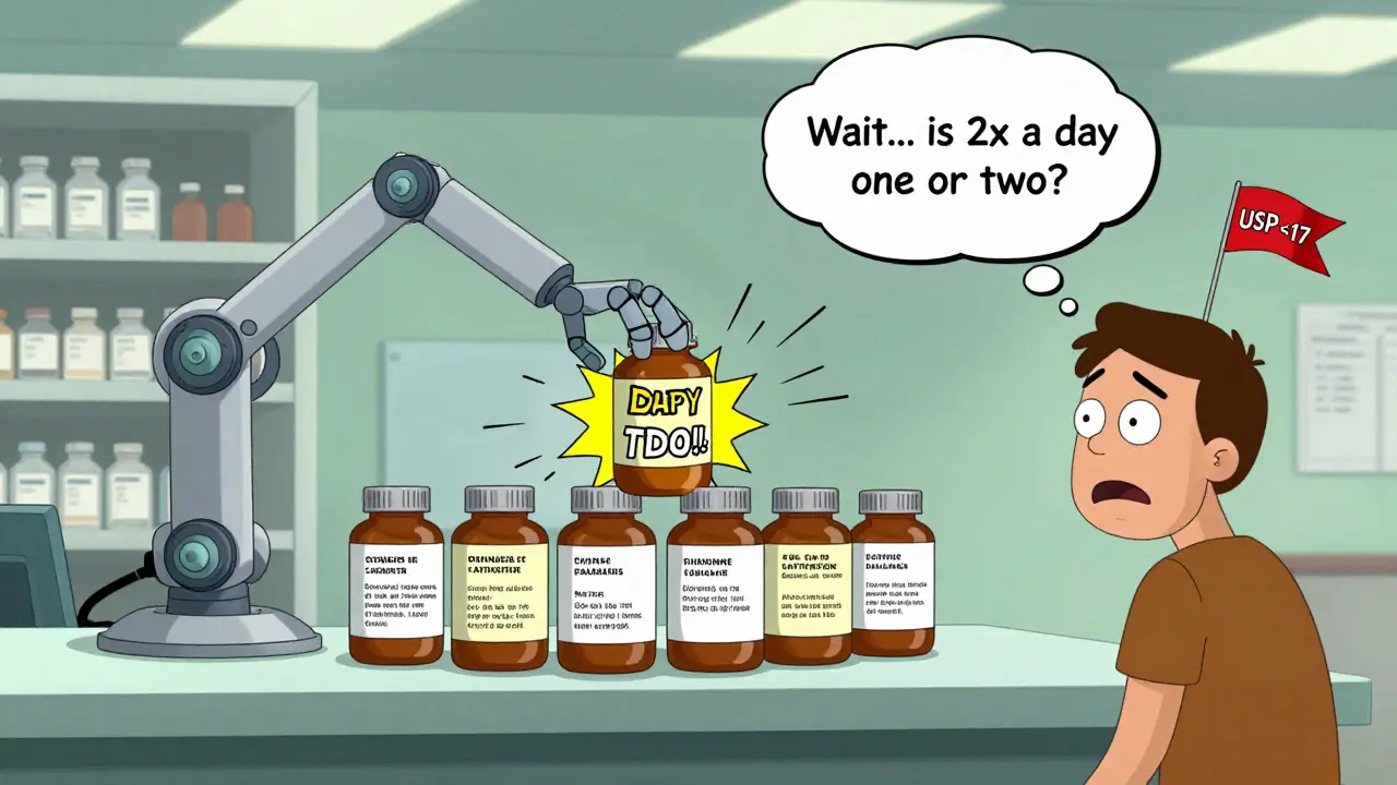
One Reddit user shared how they took double their prescribed dose of a blood thinner because the refill label changed from "take 1 tablet twice daily" to "take 1 tablet 2x a day." They thought "2x a day" meant two tablets at once. They ended up in the ER.
Dr. Michael Cohen, president of the Institute for Safe Medication Practices, says name confusion and unreadable labels are the #1 reason for medication errors. He estimates that if every prescription label followed USP <17> standards, medication errors would drop by 30-40%.
And it’s not just older adults. A 2021 survey by the National Community Pharmacists Association found that 68% of patients-of all ages-struggle to understand their labels. Younger people? They’re just as confused. One 28-year-old told a pharmacist she didn’t know if her antibiotic was supposed to be taken with food because the label said "take as directed." She didn’t know what "as directed" meant.
Pharmacies report that label confusion leads to more phone calls, more returns, and more time spent explaining instructions. In Texas alone, 18% of all reported medication errors between 2019 and 2022 were linked to label design.
Who’s Trying to Fix This?
Change is slow, but it’s happening.
CVS Health announced in April 2023 that it would roll out USP <17> standards to all 10,000+ of its pharmacies by the end of 2024. Why? Because a pilot in 500 stores cut patient clarification calls by 33%. That’s fewer phone calls. Fewer mistakes. Happier customers.
The Biden administration’s 2022 Patient Safety Action Plan set a goal of 90% state adoption of standardized labeling by 2026. The FDA also released draft guidance in June 2023, hinting that federal rules might come soon. But industry analysts say it could still take 3-5 years before the government makes it mandatory.
Meanwhile, companies are building workarounds. Smart pill bottles with QR codes now link to audio instructions. Mobile apps scan your label and translate it into plain language. Some pharmacies offer large-print, braille, or audio labels on request-but only 38% offer large print, 12% offer braille, and just 5% offer audio, according to a 2022 audit.
What You Can Do Right Now
You don’t have to wait for the system to fix itself. Here’s how to protect yourself:
- Ask for a plain-language copy. Say: "Can you print this in a larger font with the reason for the medicine written out?" Most pharmacists will do it.
- Compare labels. If your new label looks different from the last one, ask: "Did anything change?"
- Use a pill organizer with printed instructions. Write down the purpose, dose, and time on the box.
- Take a photo of your label when you get it. Keep it in your phone. Reference it when you’re unsure.
- Ask the pharmacist to explain it out loud. Don’t rely on reading. Hearing it helps.
Medication labels are supposed to keep you safe. Right now, they’re a lottery. But you have power. You can ask. You can demand clarity. And you should.
Because no one should have to guess whether "take 1 tablet 2x a day" means one tablet twice-or two tablets at once.


Reviews
Man, I never thought about this until my mom almost took her insulin twice because the label switched from "once daily" to "1x a day." She’s 72, blind in one eye, and the font shrunk so much she thought "1x" meant one pill, then another one later. I had to drive 45 minutes to the pharmacy just to get them to print a new one in 14-point Arial. This isn’t just annoying-it’s a public health crisis waiting to happen.
And don’t even get me started on how some states force pharmacies to jam in 12 extra lines of legal junk. I saw a label in Texas that had the pharmacy’s fax number, the prescriber’s DEA number, and a QR code to a PDF that didn’t even load on my phone. Meanwhile, the actual instruction? "Take 1 tablet 2x daily" in 7-point font. That’s not a label. That’s a puzzle for people who are already stressed about their health.
USP standards exist for a reason. They’re based on real studies, not bureaucracy. And yet, half the country’s still using labels that look like they were designed by a intern who got fired for being too nice. CVS is finally doing the right thing. Why aren’t the others?
I’ve started printing my own labels in big font and taping them to my pill organizer. My wife laughs, but she’s the one who caught me taking my blood pressure med at 3 a.m. because I misread the time. We’re all just one misread label away from disaster.
Someone needs to make this a national campaign. "Don’t Guess. Ask." Maybe put it on billboards next to "Don’t Text and Drive."
Of course the system’s broken. You can’t expect people to read labels when they’re too lazy to learn basic medical terms. "Take one tablet twice a day" is clear. If you can’t understand that, maybe you shouldn’t be managing your own meds.
And don’t get me started on the "I need a larger font" crowd. I’ve seen people ask for braille on a bottle of ibuprofen. It’s not rocket science. If you’re confused, ask the pharmacist. They’re not your personal translator.
Blaming the label design is just another way to avoid responsibility. You want safety? Take ownership. Read the damn thing. Or better yet-don’t self-medicate. Go to the doctor. That’s what they’re for.
Oh sweet mercy, the USP standards are a joke. They’re like the IKEA instructions for your life-well-intentioned, but totally ignored because nobody cares enough to enforce them.
And yet, somehow, the same people who scream about "patient safety" when a label’s too small are the ones who refuse to use pill organizers, skip their med reviews, and think "as directed" means "do whatever feels right."
Let me guess: you also think your doctor should write your prescriptions in emoji? "💊 1x 🌞 + 🌙"?
Stop blaming the system. Start blaming the people who won’t take 30 seconds to ask a question.
bro i just got my new label and it said "take 1 tab 2x a day" and i thought "2x" meant 2 tabs?? so i took 2 and then realized maybe it meant twice?? like… is this a test??
also why is the pharmacy name in a different spot?? did they move it to make me feel like i’m losing my mind??
also why does it say "for HTN"?? is that like a secret code?? i thought it was a typo at first.
my pharmacist just smiled and said "you’ll get used to it." no. no i won’t. i’m 29 and i’m terrified of my own meds.
Let’s be real: the core issue isn’t font size or spacing-it’s cognitive load. When a label forces a patient to decode 3 different formats, 2 state mandates, and 1 vendor’s UI quirks, you’re not just asking them to read-you’re asking them to perform triage on their own health.
Studies show that patients with low health literacy are 3x more likely to make dosing errors. But we keep treating this like a design problem instead of a systemic failure. The USP guidelines aren’t optional-they’re a harm reduction protocol. And if we’re not mandating them, we’re basically saying: "It’s fine if someone dies because they misread a 6-point font."
Pharmacies aren’t evil. They’re stuck between FDA non-rules, state mandates, and software vendors who think "compact layout" means "save ink." We need federal standardization. Not because it’s convenient-but because people are dying because they thought "2x" meant "2 pills."
As someone who grew up in India and now lives in the U.S., I’ve seen labels on both sides. In India, prescriptions are handwritten on slips of paper with a single line: "Take 1 after food, twice daily." No font issues. No QR codes. Just clarity.
Here? You get a label that looks like a legal contract printed by a drunk robot. I had to ask my pharmacist to read my label out loud last week because I couldn’t tell if the "10 mg" was for the pill or the daily dose.
And honestly? I don’t blame the pharmacy. They’re doing their best under impossible rules. But the system? It’s broken. We need a national standard. Not a suggestion. Not a guideline. A law.
And while we’re at it-why don’t we have audio labels for the blind? Or a universal symbol for "take with food"? We have emoji for everything else. Why not for medicine?
I took my meds wrong once because the label changed. I thought "2x a day" meant two pills at once. I threw up for hours. My husband had to drive me to urgent care. I still have the bottle. I keep it as a reminder.
Now I write everything on my hand in Sharpie. "1 pill. Morning. Night."
Why does this have to be so hard? I’m not stupid. I just want to live.
Y’all are missing the real win here: CVS’s rollout. They cut phone calls by 33%. That’s not just customer service-it’s cost savings. Less confusion = less ER visits = less liability.
And here’s the kicker: patients who got the new labels reported feeling more confident. Not just safer. Confident. Like they actually understood what they were taking.
So why aren’t all pharmacies doing this? Money. Time. Inertia.
But if CVS can do it, so can everyone else. It’s not a tech problem. It’s a leadership problem. Someone needs to say: "We’re not doing this because it’s nice. We’re doing it because it saves lives."
And if you’re a pharmacy owner? Stop waiting for the government. Do the right thing. Your customers will thank you. And so will their families.
My grandma died because of a label. Not because she didn’t take her meds. Because she took too many. The label switched from "Take 1 tablet daily" to "Take 1 tablet 1x a day." She thought "1x" meant "once per hour." She took 12 pills before we found her.
That’s not a mistake. That’s a system failure.
I’m not mad at the pharmacy. I’m mad at the people who let this keep happening. We have the standards. We have the proof. We have the tech. We just don’t have the will.
Let’s stop calling it "label design" and start calling it what it is: a silent killer. And let’s fix it. Now.
Oh honey, I used to work at a pharmacy. Let me tell you-no one wants to print labels that look like a ransom note. But state laws? They’re like a game of Jenga. Pull one out and the whole thing collapses.
We had to fit in: pharmacy name, address, phone, prescriber, DEA, Rx number, refill info, bilingual text, expiration, lot number, and then the actual instructions… in 7-point font.
One day, a woman came in crying because her label said "for HTN" and she thought it meant "HIV." I had to explain that HTN = hypertension. She said, "But I’m not a doctor."
So we started printing "for high blood pressure" on the side. No one asked for it. We just did it. Because we’re humans, not robots.
And yeah, we got in trouble for "deviating from the template."
So yeah. The system is broken. But we’re still trying. Just don’t expect perfection. We’re all just trying not to kill someone today.
I’ve been a pharmacist for 22 years. I’ve seen labels go from handwritten to dot matrix to laser-printed to QR-code-linked audio.
Here’s what I know: the people who struggle the most aren’t the elderly. They’re the young adults with chronic conditions-diabetics, asthma patients, people on anticoagulants. They’re supposed to be tech-savvy. But when the label changes, they panic.
One 21-year-old asked me if "take as directed" meant "take when you feel like it." I almost cried.
USP standards work. They’ve been proven. But pharmacies are stuck between legal requirements, software vendors, and corporate cost-cutting.
I’ve printed extra labels by hand for patients. I’ve taped them to the bottle. I’ve called doctors to ask for handwritten instructions.
And I’ve watched people die because they thought "2x" meant "two pills at once."
It’s not about fonts. It’s about dignity. Everyone deserves to understand what they’re taking. And if we can’t make that happen? We’ve already lost.
While I appreciate the emotional weight of this issue, I must emphasize that the absence of federal regulatory authority over prescription label formatting constitutes a significant gap in the U.S. pharmaceutical safety infrastructure. The United States Pharmacopeial Convention’s General Chapter <41> represents a scientifically validated framework for minimizing medication error through cognitive ergonomics. Its non-binding status, however, renders it functionally inert in jurisdictions where state statutes override its recommendations. This regulatory fragmentation is not merely an inconvenience-it is a structural vulnerability in public health policy. To mitigate this, I propose the immediate establishment of a federal advisory commission, empowered to codify USP standards into enforceable FDA guidelines under Title 21 CFR Part 211. Without such intervention, we continue to rely on voluntary compliance in a sector where error is not abstract-it is lethal.
Wow. So now we’re all supposed to be pharmacists? I’m supposed to memorize every label change? What’s next? Do I need a degree to take my own blood pressure pill?
And why is everyone acting like this is new? I’ve been getting different labels since 2008. I just memorize the pill color. That’s how I know it’s the right one.
Also, "take 1 tablet 2x a day" is the same as "take one twice daily." It’s not a code. It’s English.
People are just too lazy to read.
Maybe stop blaming the system and start using your brain.